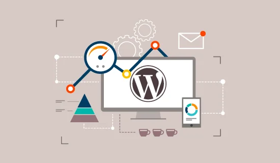
In today’s digital age, where users access websites from a myriad of devices, ensuring a seamless user experience across different screen sizes is crucial. WordPress, as one of the most popular content management systems (CMS), offers powerful tools and themes that facilitate responsive design, allowing websites to adapt dynamically to various devices.
Understanding Responsive Design
Responsive design refers to creating web pages that automatically adjust their layout and content to fit the screen size and orientation of the device being used. It ensures optimal viewing and interaction experience, enhancing usability and satisfaction for visitors. With the proliferation of smartphones and tablets, responsive design has become essential for modern websites.
Benefits of Responsive Design
- Improved User Experience: Users can navigate and consume content easily without having to zoom in or scroll excessively.
- SEO Advantages: Responsive websites tend to rank higher in search engine results, especially since Google prioritizes mobile-friendly sites in its indexing.
- Higher Conversion Rates: A seamless experience across devices leads to increased engagement and conversions.
- Reduced Bounce Rates: Visitors are more likely to stay on a site that is easy to use on any device.
Implementing Responsive Design in WordPress
- Choosing a Responsive WordPress Theme: Select a theme that is explicitly labeled as responsive or mobile-friendly. Popular themes often include responsive design as a core feature.
- Customizing Themes: Customize the theme’s CSS and design elements to ensure consistency and usability across different screen sizes.
- Testing Responsiveness: Use tools like Google’s Mobile-Friendly Test to check how your site appears and performs on various devices.
Best Practices for Responsive Design
- Prioritize Content: Arrange content hierarchically, ensuring critical information is displayed prominently on smaller screens.
- Optimize Images and Media: Use responsive images and optimize media files to improve load times on mobile devices.
- Touch-Friendly Navigation: Implement touch-friendly menus and buttons to enhance usability on touchscreens.
Common Challenges and How to Overcome Them
- Complex Layouts: Simplify complex layouts for smaller screens, prioritizing essential content and functionalities.
- Performance Issues: Optimize code, minimize HTTP requests, and leverage caching to improve site speed on mobile devices.
- Cross-Browser Compatibility: Test your site across different browsers and devices to ensure consistent performance and appearance.
Tools and Resources for Responsive Design
- WordPress Plugins: Use plugins like WPtouch or Jetpack to enhance responsiveness and mobile optimization.
- Frameworks: Explore responsive design frameworks like Bootstrap or Foundation, which offer pre-built components and grid systems.
- Community Support: Engage with WordPress forums and communities for advice, troubleshooting, and best practices in responsive design.
Future Trends in Responsive Design
- AI and Machine Learning: Predictive algorithms may soon tailor website content and layout based on user behavior and device capabilities.
- Enhanced Personalization: Responsive design may evolve to provide more personalized experiences across devices, optimizing content delivery.
Takeaway
Responsive design is not just a trend but a necessity for modern websites, especially those built on WordPress. By prioritizing user experience and adapting to technological advancements, you can ensure your site remains relevant and accessible to a diverse audience.